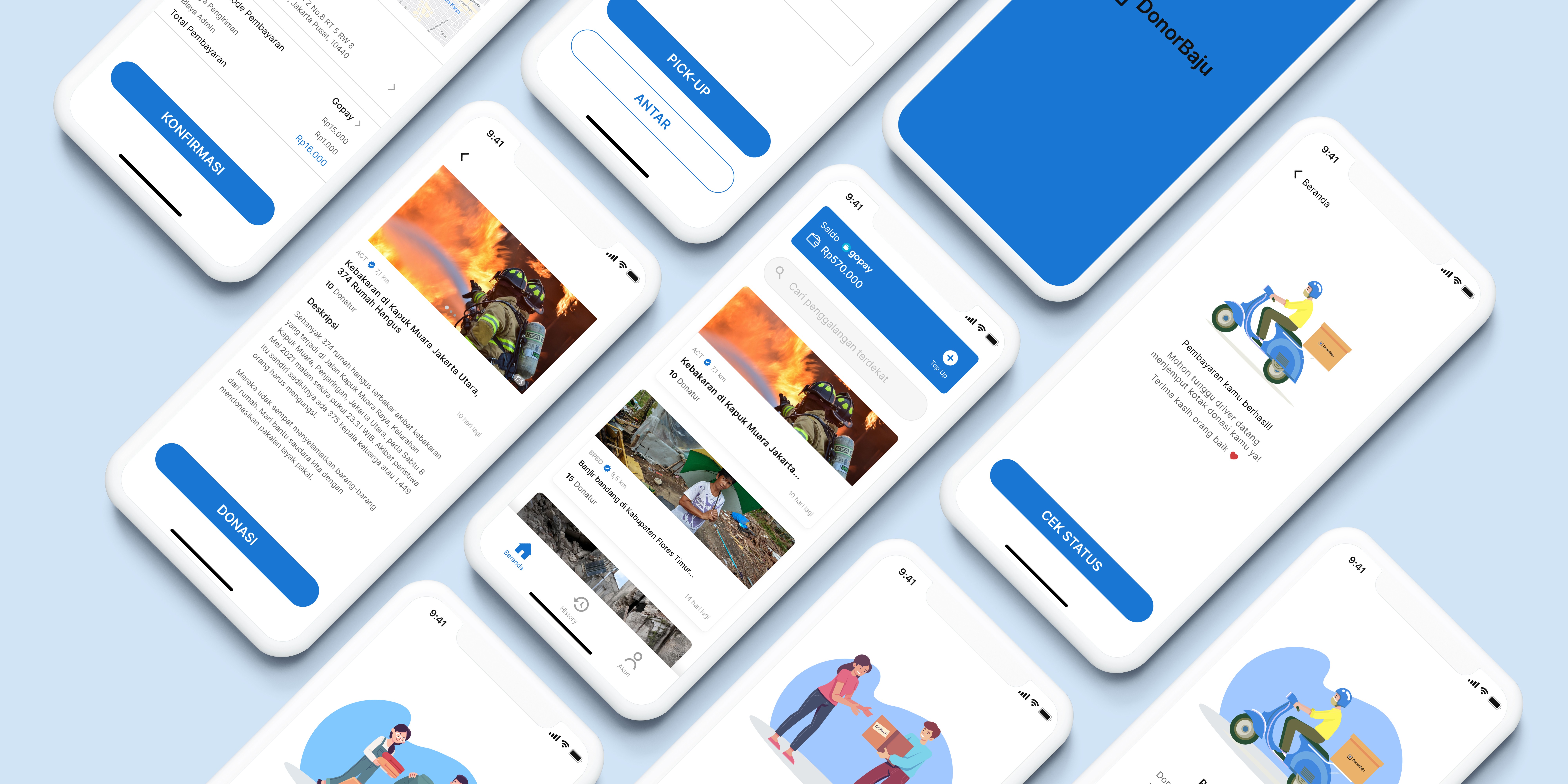
Project: Personal
Roles: UI/UX Designer, Researcher
Tools: Figma
Overview
Context — Donorbaju started when I wanted to take part in the design challenge from the dwinawan.com website, which is about clothes that are no longer used, assuming that the design is not up-to-date or bored with the color. So the possibility of the clothes just piling up in the wardrobe, stored in the warehouse, and eaten by termites.
Problem — After conducting interviews with 5 people whose scope is Male/Female aged 18-35 years, living in Indonesia and often shopping for clothes. It turned out that the problems experienced were because they were not comfortable wearing these clothes, because they were too small, and they had no taste. Want to donate unused clothes but don't know who really needs it.
Challenge — Can donate or give clothes that are not used efficiently and on target.
Solution — Insights and challenges obtained previously made the way to solve these problems clearer, so the solution chosen & executed was the creation of an application that connects donors with donation-raising organizations.
Product — This application is similar to Crowdfunding applications such as Kitabisa, with a delivery feature for the delivery of donated goods. So the company became the main inspiration when making DonorBaju.
Please try the prototype of DonorBaju ↓
Process
In making products, we need a framework. This time I will use a design thinking framework consisting of empathy, define, idea, prototype, and test.
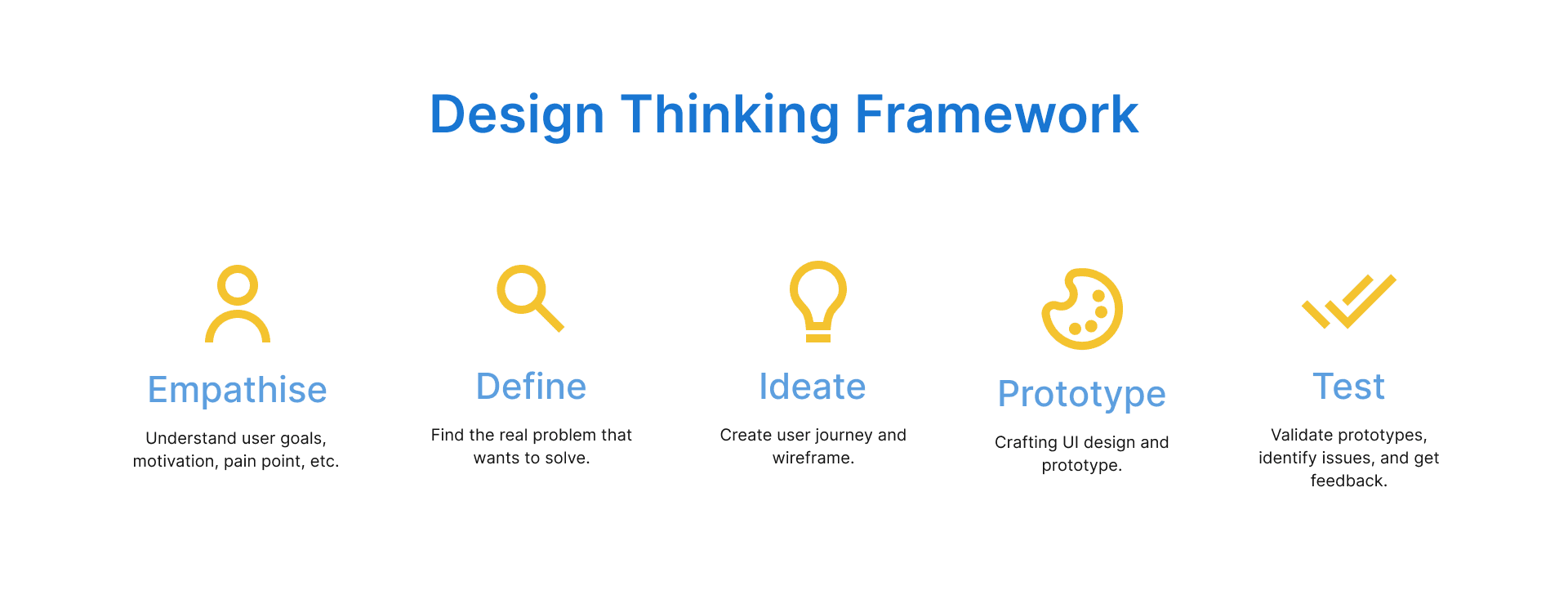
Source: https://www.nngroup.com/articles/design-thinking/
Stage 1 - Empathise
At this stage, carry out 2 stages namely; Planning the Research, Creating the Research Guideline, and Conducting the Research. This initial process is the stage where we know exactly what the problems of our theme are.
Uses of empathy:
Make products based on user needs
Understand user goals, motivations, and pain points
There are several ways we can figure out the problem. This can be done with an IDI (in-depth interview), FGD (focus group discussion), or a survey. Because I didn't understand at all what was the main problem of potential donors and wanted to know in-depth, I chose the IDI method for 5 potential donors.
Planning the Research
Defining the Objective
Our goal here is to find out or explore motivations/pain points/barriers. We try to dive into a particular problem and find out the root of the problem. And this is the purpose of my research:
Understand how potential donors think about donating.
Scoping
Scoping helps me to understand the target population. Some of my scopes are:
Male / Female aged 18 - 35 years
Live in Indonesia
Love shopping
Defining Research Question
Research questions are the main questions that must be answered at the end of the study. My main research question:
What is the reason for the potential donor not using the clothes stored in the closet or warehouse?
What plan do you want the potential donor to make of the clothing?
What is the motivation of the potential donor to donate the clothes?
Do potential donors have problems with the current donation method?
Listing the Hypothesis
The following is my hypothesis:
Potential donors don't like the design because it's not up-to-date or because it's too small.
Given to relatives, given to neighbors.
Want to be useful for others.
Want to donate to people who really need it, but don't know who and where to go.
Stage 2 - Define
I continued on to the define phase after doing the empathy phase. Where in this phase I want to determine our target users based on the behavior I found during the In-depth Interview and identify the pattern of problems I found from the previous phase.
Personas
By defining user stories, I was able to capture various frustrations and goals that potential donors may have. Creating personas enabled me to ensure that every feature and function I designed was user-centric.
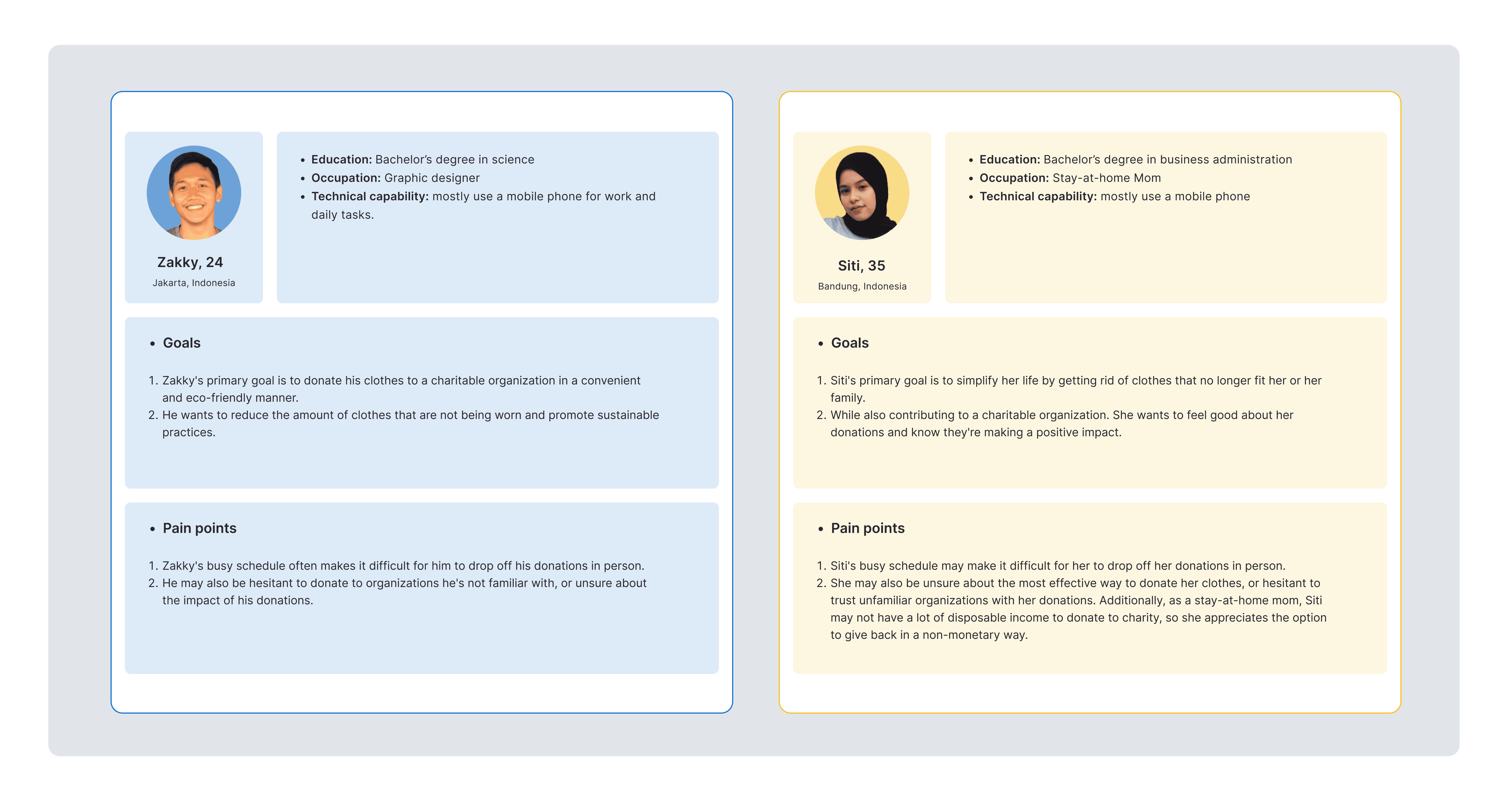
User Personas for the potential donor
Affinity Diagram
From the results of the interviews, there will be many points from the respondents' answers that will become observations. Then, the findings are classified according to convenience. Here I use an affinity diagram to make classification easier.
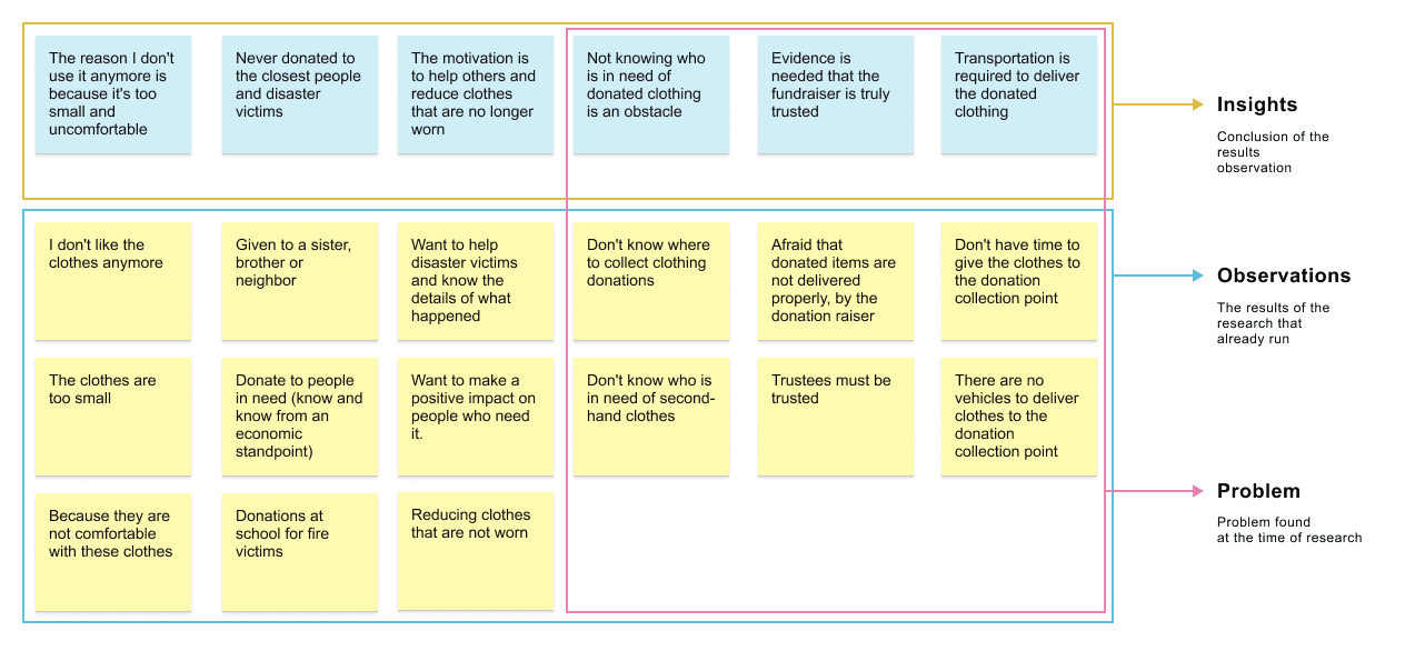
Affinity Diagram DonorBaju
From the insights we get, we will then create a mandate design. The design mandate is our own idea to solve the problem from insight. We don't have to finish everything, but we can also choose and prioritize what can be done. The following is a mandate design from some of the insights that have been obtained:
Create a platform where people can donate clothes easily
Provide information on ongoing donation campaigns
A trusted donation-raising partnership
Provide goods delivery services to donation collection points
Update proof of submission of donations by donors
Stage 3 - Ideation
User Job & User Journey
User Job is what the user wants to complete and User Journey is the process of a user reaching a goal.
Starting with creating a user job (work that must be completed), then just creating a user journey. Below is a list of the main user jobs along with examples of user journeys.
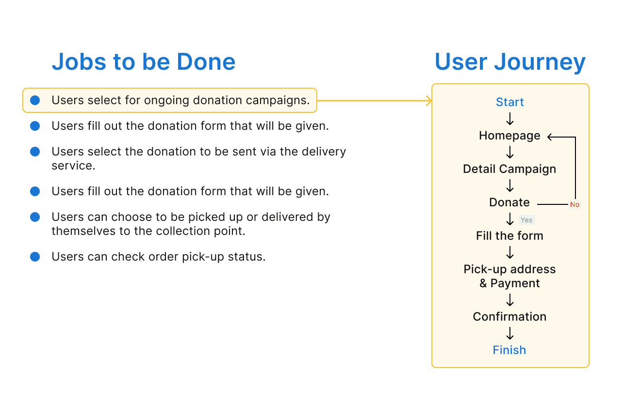
Jobs to be Done & User Journey — Donorbaju
Wireframe
Wireframe helps in easily drafting, before creating a High-Fidelity design.

Wireframe - DonorBaju
Stage 4 - Prototype
At this stage, we will do 2 things:
High-Fidelity Design
Prototype
High-Fidelity Design
I will start from the name of this application, namely DonorBaju (Baju in Indonesian means Clothes). Why the name is DonorBaju because I want people who have decent clothes that are not used anymore to be able to donate to those in need.

Logo - DonorBaju
I created a simple logo with a t-shirt icon inside a square that represents a box. Hopefully, DonorBaju can provide benefits for donors as well as for recipients of donations.
So, here is the high-fidelity design from DonorBaju:
Splash Screen & On-Boarding Screen
The Onboarding screen on the DonorBaju app is the initial screen that users see upon opening the app for the first time. The purpose of the Onboarding screen is to introduce users to the app's functionality, and benefits, as well as guide them through the process of using the app.
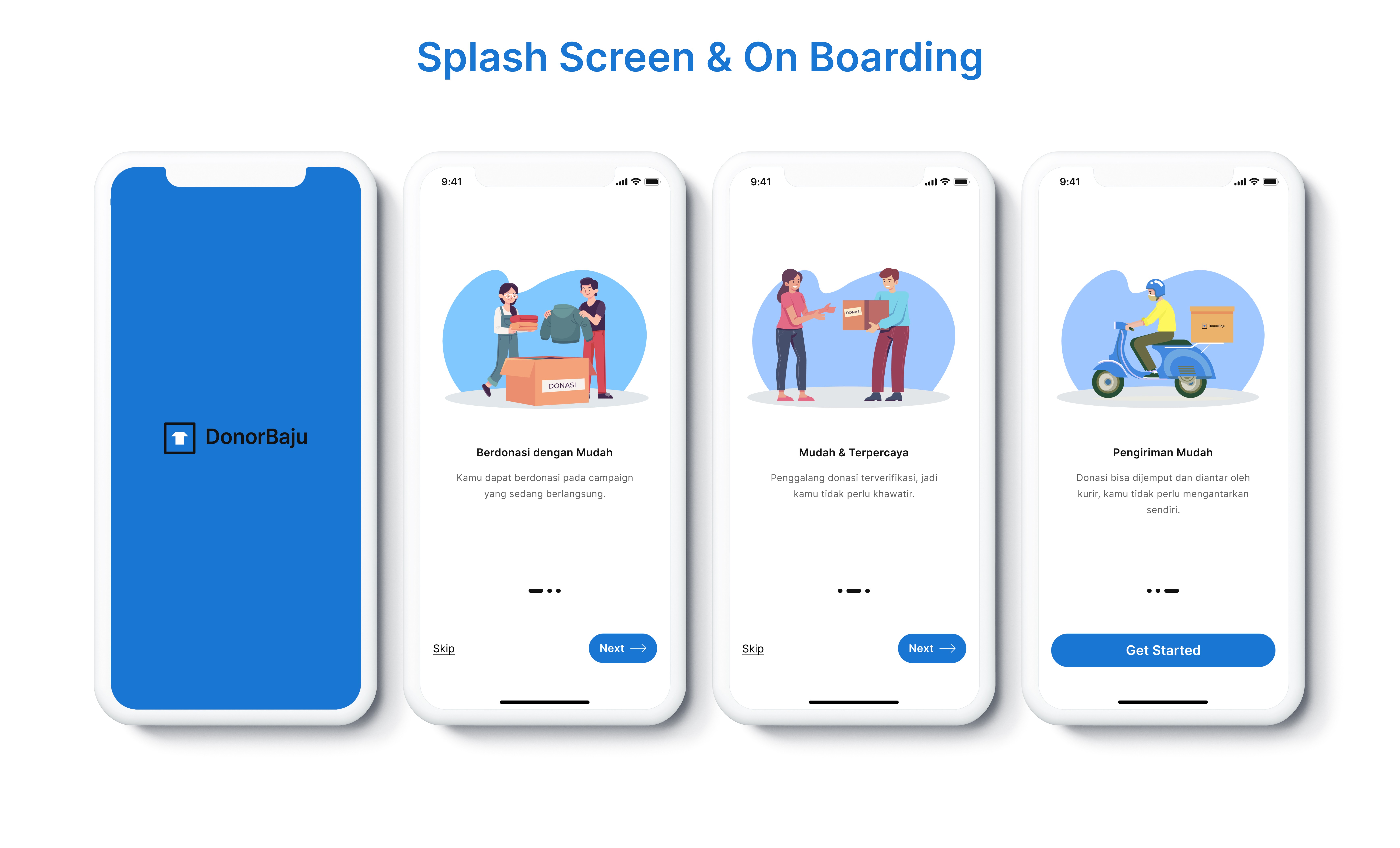
On-Boarding Screen
Login & Registration Screen
The Login & Registration screen for the DonorBaju app is a key component in ensuring that users can securely access the app's features and donate their clothes conveniently. The screen is divided into two main sections: the login section for existing users and the registration section for new users. In the login section, users are prompted to input their email address or username and password to access their account.
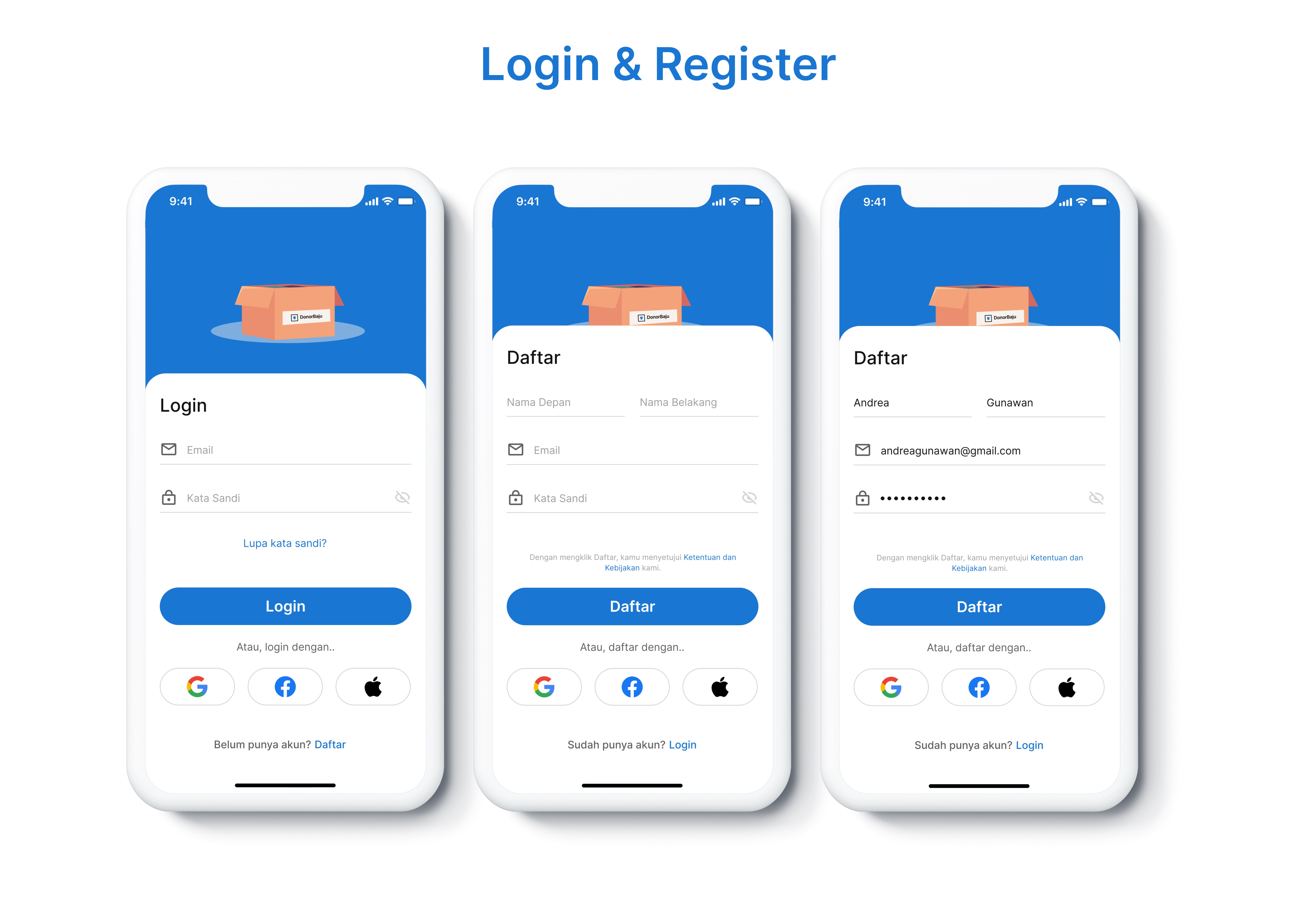
Login & Register Screen
Donation Process
The donation process on DonorBaju app is designed to make it as easy and convenient as possible for users to donate their clothes to those in need. It starts from the homepage, where users can choose from different campaigns, such as the one for house fire victims, and click on the Donate button. After clicking on the Donate button, users are taken to a form where they can input the details of their donation, such as the clothing type, weight in kilograms, and upload a photo of the box. Additionally, users can choose whether they want to schedule a pick-up or drop off the donation at a specific location. If the user chooses to schedule a pick-up, they will need to confirm their address and make a payment. Once the donation is scheduled, the user can track the status of the pick-up within the app. Overall, the donation process on DonorBaju app is designed to be simple and user-friendly, allowing users to easily contribute to a good cause and help those in need.
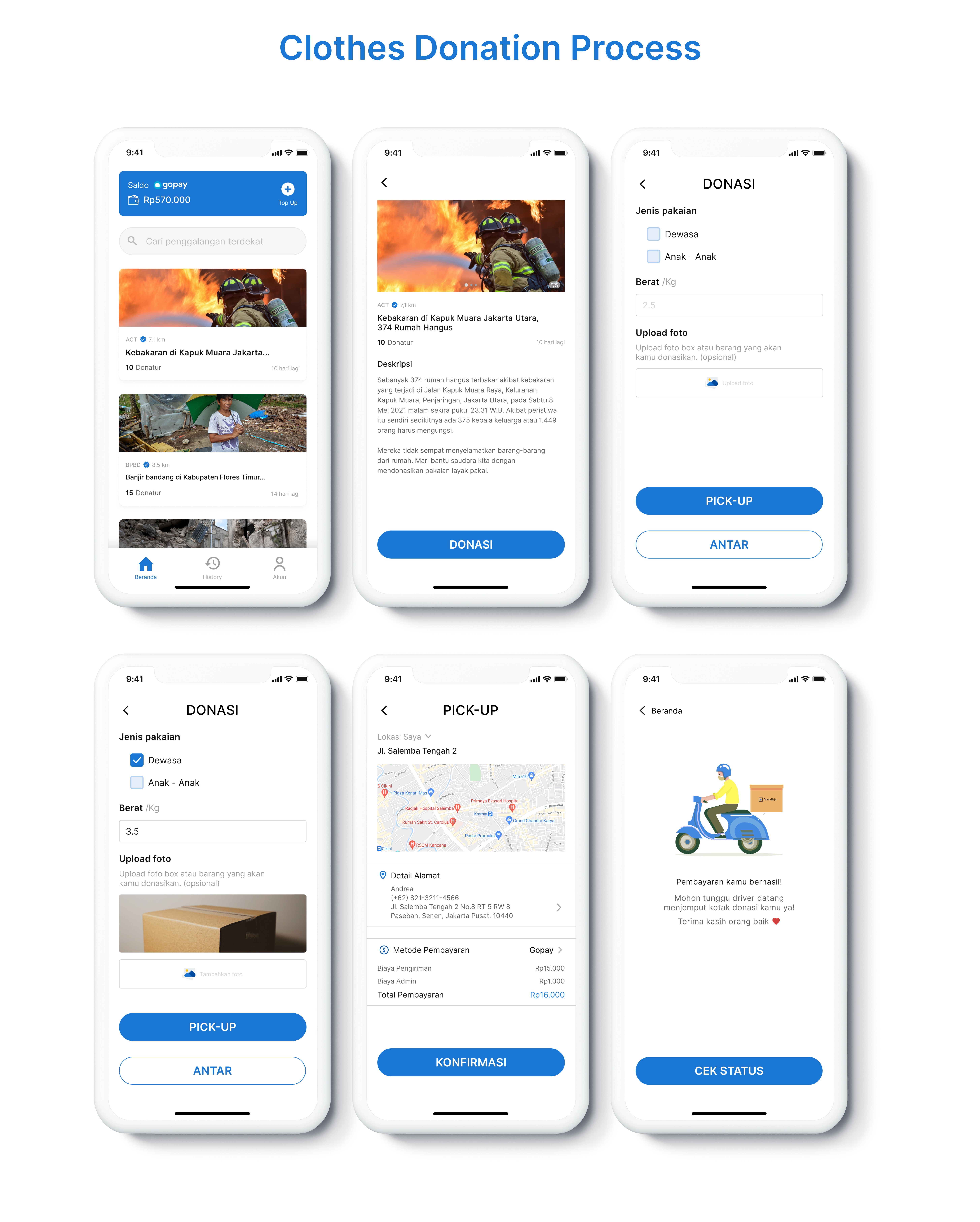
Donation Process Screen
Prototype
I made a prototype using Figma because it's easy to use and good for prototyping. The results can be tried by everyone who gets the prototype link. Please try the DonorBaju prototype. 👇
Stage 5 - Testing
Usability Testing (UT)
Usability testing is an essential step in the process of testing applications, particularly those that are still in the prototype phase. It helps determine whether the application is user-friendly and can be easily used by its target audience. I conducted remote usability testing using Maze with the user, which helped me identify the areas where the user encountered issues, such as mis-clicking. In addition, I conducted remote usability testing by making video calls with several users to observe their facial expressions and gather their feedback on using the application.
After conducting the usability testing, I was able to gather valuable feedback and insights on the user's experience. I used this feedback to make significant improvements to several pages, ensuring that the application is intuitive and easy to use for its target audience. By conducting usability testing and making necessary improvements, we can create an application that meets the needs of its users and enhances their experience.
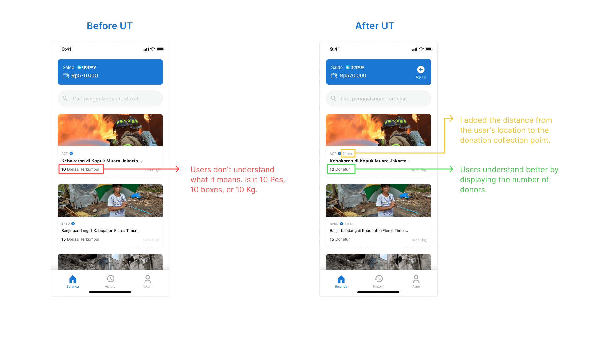
Last Stage — Final Thoughts
Reflections
Undertaking my first UX project, I found myself overwhelmed during the Empathizing and Defining phase, unsure whether the identified problems were actually relevant to the users. Through this experience, I learned a few valuable lessons that I can apply to future projects. Here is what I have learned:
During the Usability Testing stage, I noticed that users were confused by the use of the term "UX Writing" in the design. This made me realize the importance of understanding the user's perspective and the need to simplify any jargon or technical terms in the design.
If I had more time, I would like to conduct in-depth interviews and usability testing again to identify any potential features that could enhance the user's experience. I believe that by continuously seeking feedback from users, we can create a design that meets their needs and exceeds their expectations.
