Project: Nook
Roles: UI/UX Designer
Tools: Figma
Introduction
As a UI/UX Designer at Nook, I took on the exciting challenge of enhancing the user experience for couples through the introduction of the Explore feature. This feature, nestled in the app's navigation bar, serves as a finance digital banking solution while providing a seamless dining experience. The Explore feature integrates with Chope, allowing users to reserve tables at various restaurants in Singapore effortlessly.
Problem Statement
Couples often find it challenging to discover and plan dining experiences together. Nook aims to bridge this gap by providing a seamless solution within the app to explore and reserve tables at various restaurants.
Approach
Navigation Integration
Incorporated Explore as a dedicated menu item in the Nook app's navigation bar for easy access.
Restaurant Listings
• Curated a comprehensive list of restaurants in Singapore within the Explore menu.
• Integrated Chope for direct table reservations.
Explore Sections
• Promotion Banner: Showcasing ongoing discounts to attract users.
• Featured This Week: Highlighting 5-10 recommended restaurants.
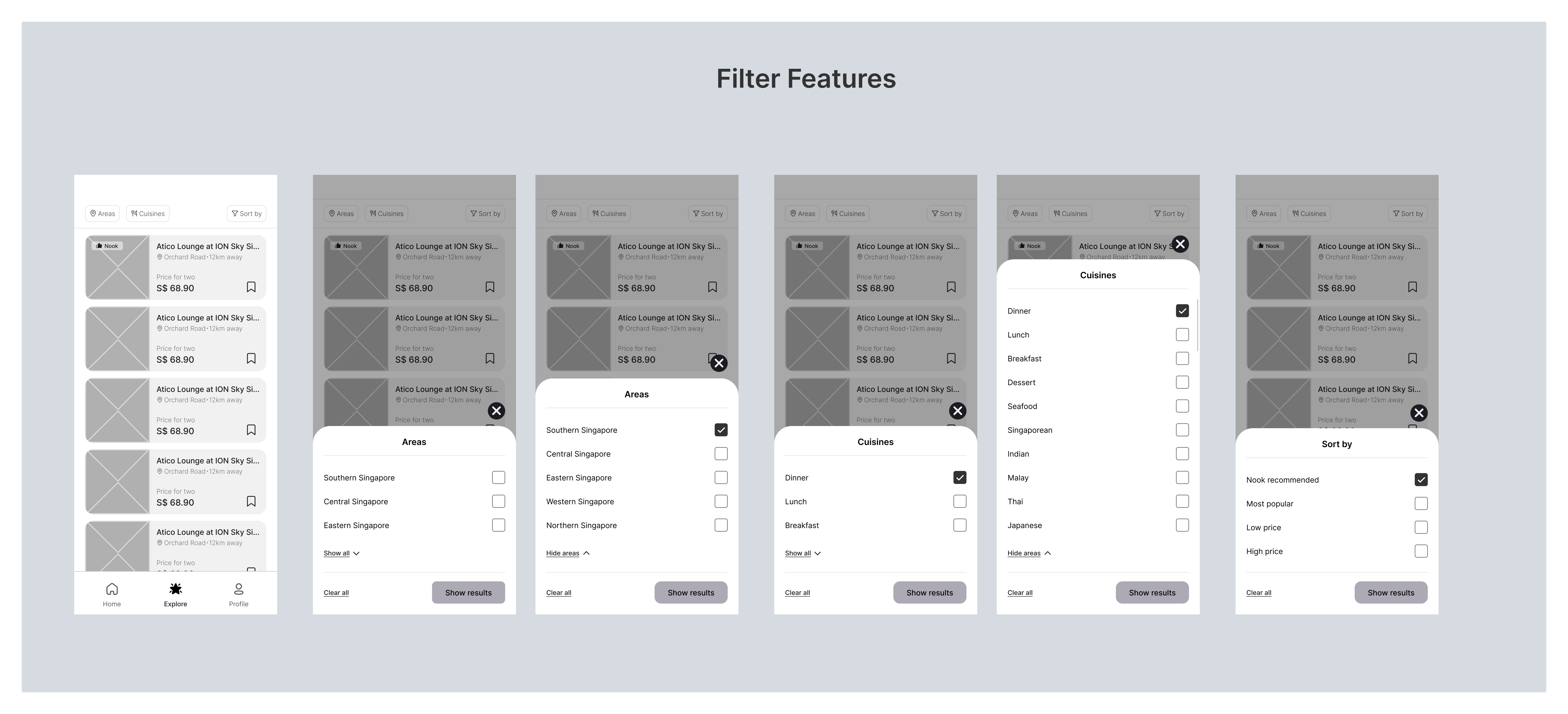
• Recommendation Filters: Users can filter recommendations by areas, cuisines, and sorting preferences.
Wishlist Feature
• Users can create and manage a wishlist of their favorite restaurants.
• Shareable wishlist links to send recommendations to their partner.
Design Process
Wireframing and Prototyping
Developed wireframes for the Explore menu
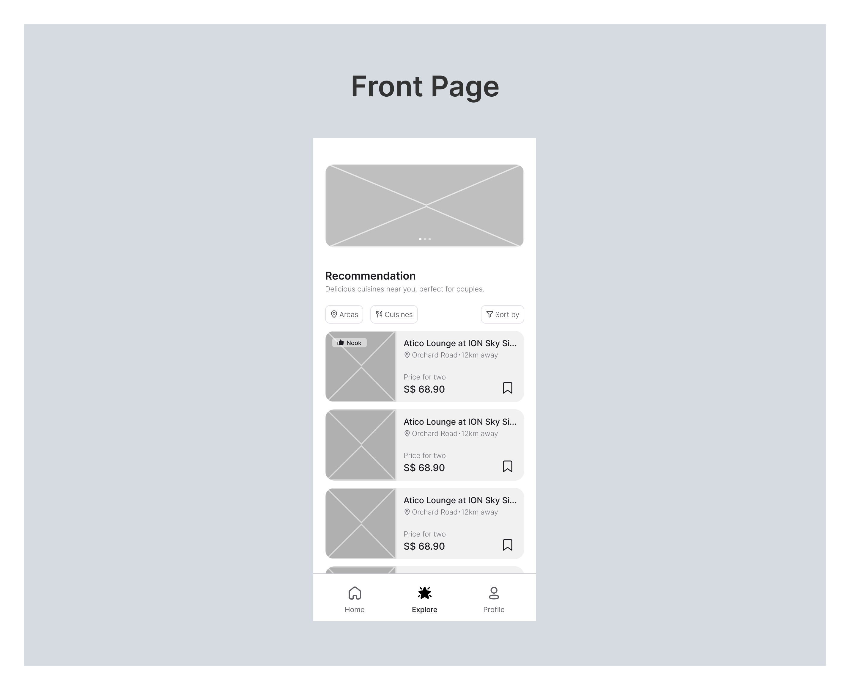
Front Page (Explore Menu)
Imagine the anticipation as users open the Explore menu. The wireframe reveals the structural foundation, akin to a blueprint for a grand culinary adventure. Banners stand as placeholders, hinting at the visual spectacle to come, promising a fusion of finance and dining experiences.
Filter Features
In the wireframe world, the Filter Section is a skeletal guide, offering three distinct pathways. Tabs and dropdowns indicate the user's choices, laying the groundwork for a personalized dining journey.
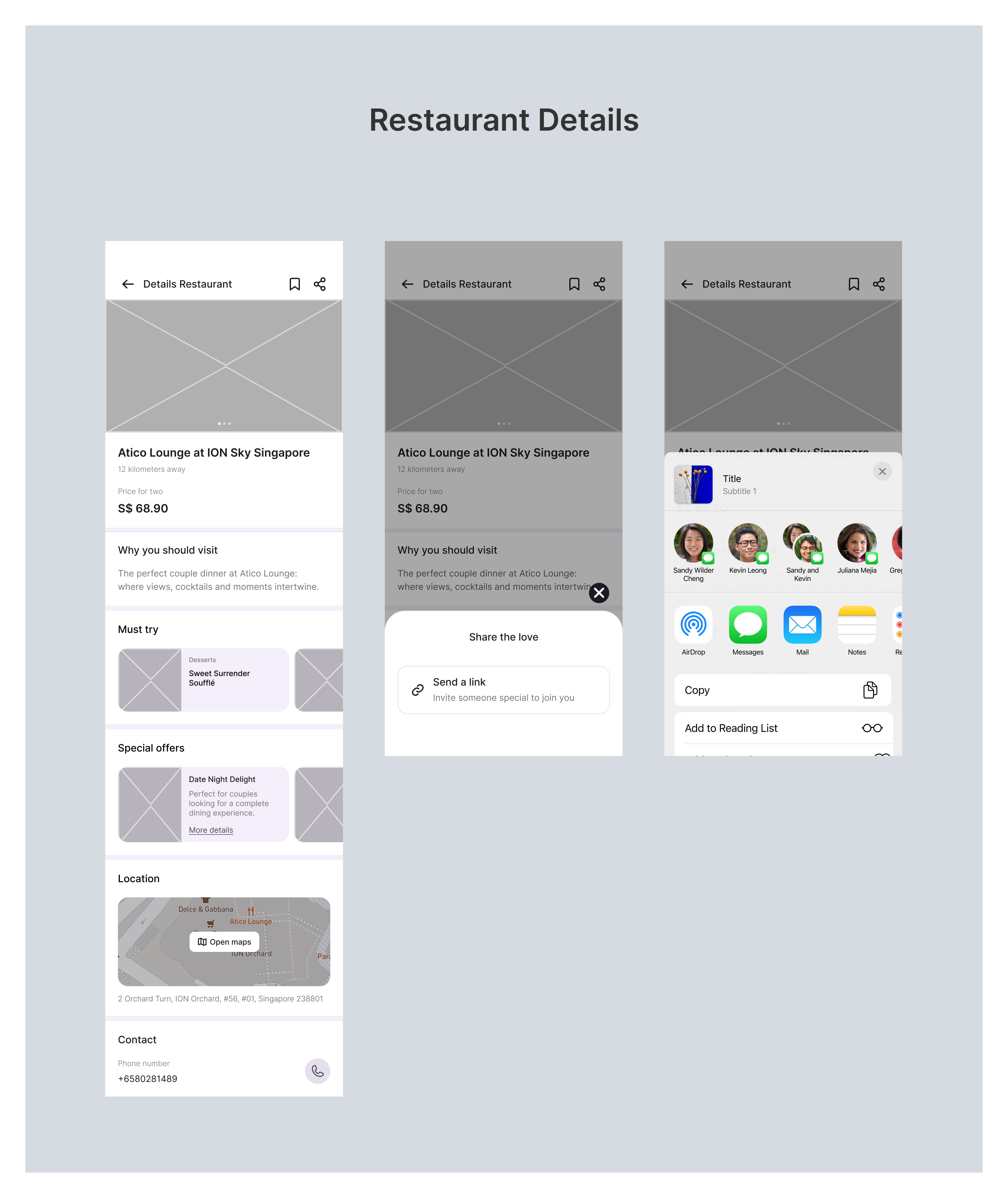
Restaurant Details
Clicking on a restaurant in the wireframe feels like unlocking a treasure trove. Essential details are outlined, providing a structured framework for the gastronomic journey.
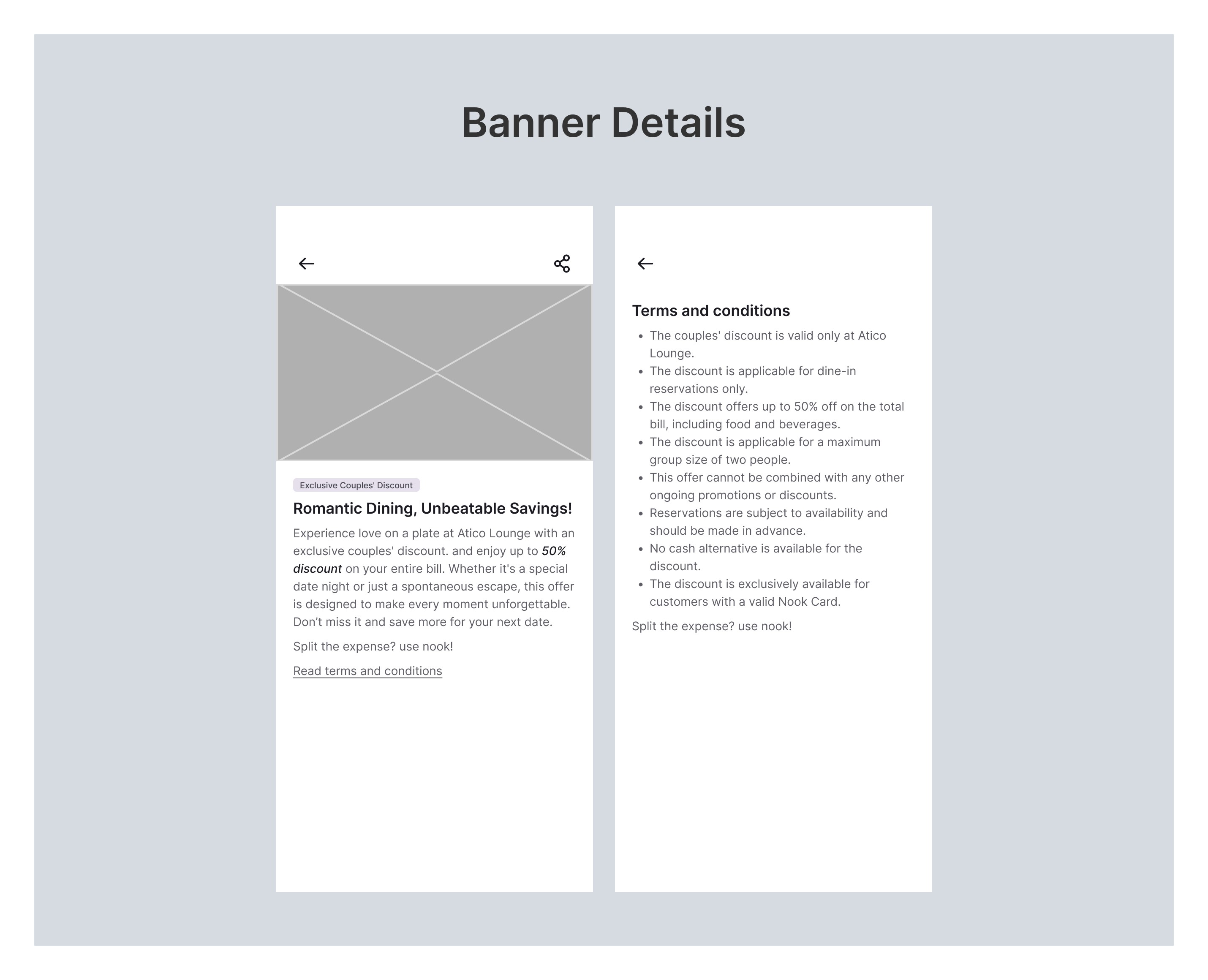
Banner Details
Zooming into a promotion banner in the wireframe is like glimpsing a teaser, indicating exclusive discounts and offers.
High Fidelity Design
Enhance the wireframes with a visually appealing interface.
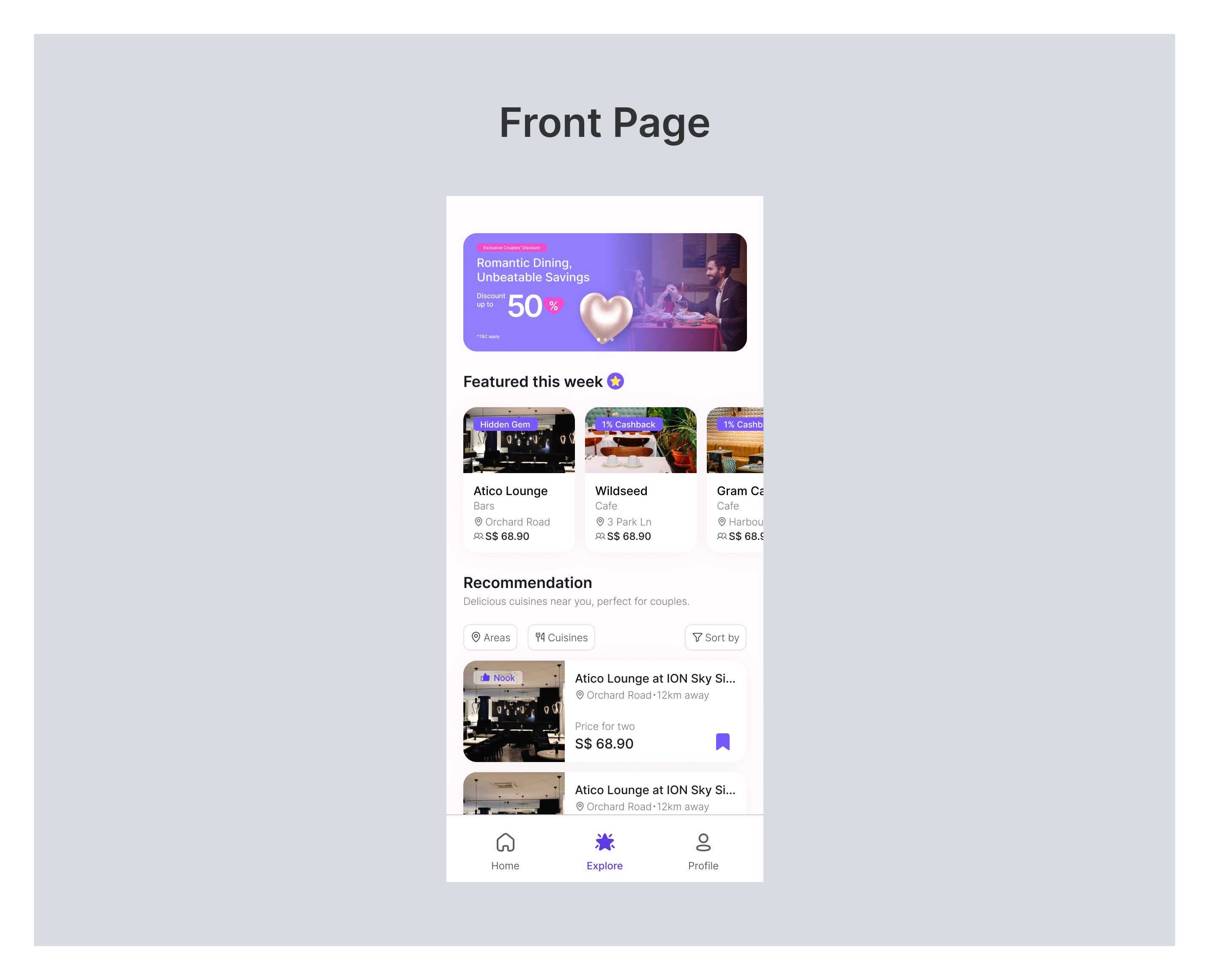
Front Page (Explore Menu)
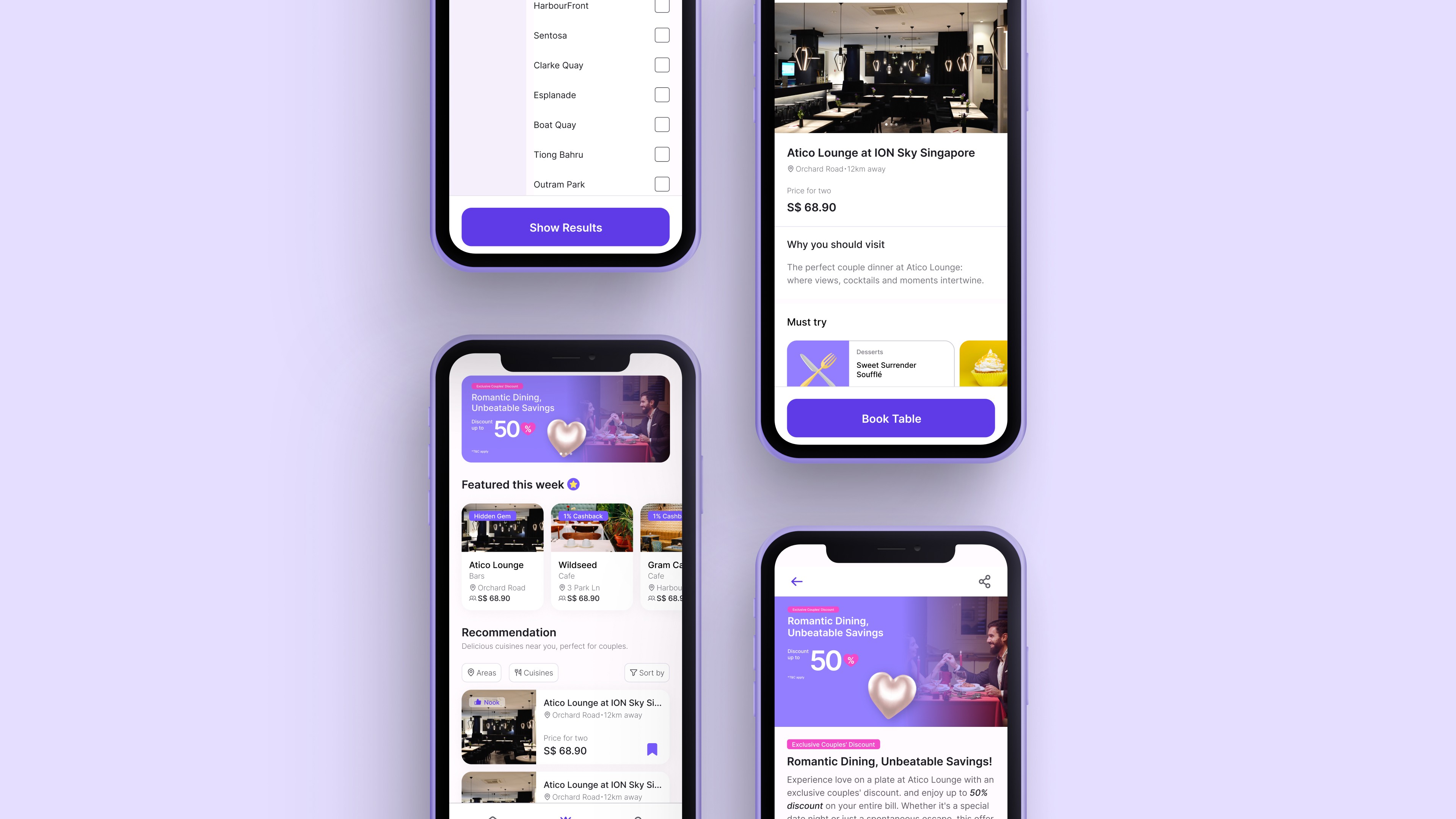
Now, as you open the Explore menu, the high-fidelity design comes to life with vibrant visuals. The Nook logo shines, and the banners burst forth with rich colors and enticing imagery, setting the stage for an immersive exploration of culinary delights.
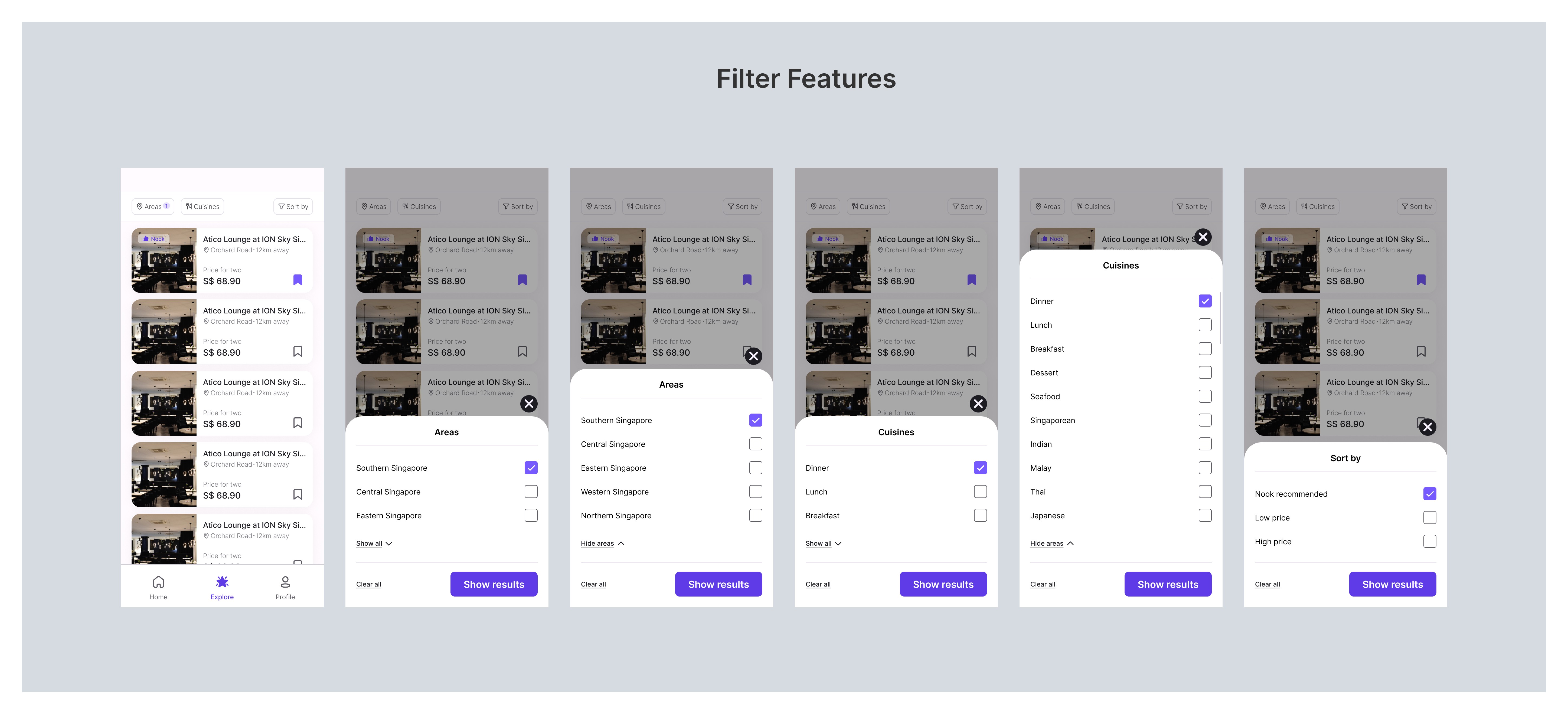
Filter Features
Transitioning to high-fidelity, the Filter Section transforms into a bustling market square, alive with vivid colors and intuitive interactions. Users navigate seamlessly through Areas, Cuisines, and Sort By options, feeling as though they're embarking on a guided tour through the culinary landscape.
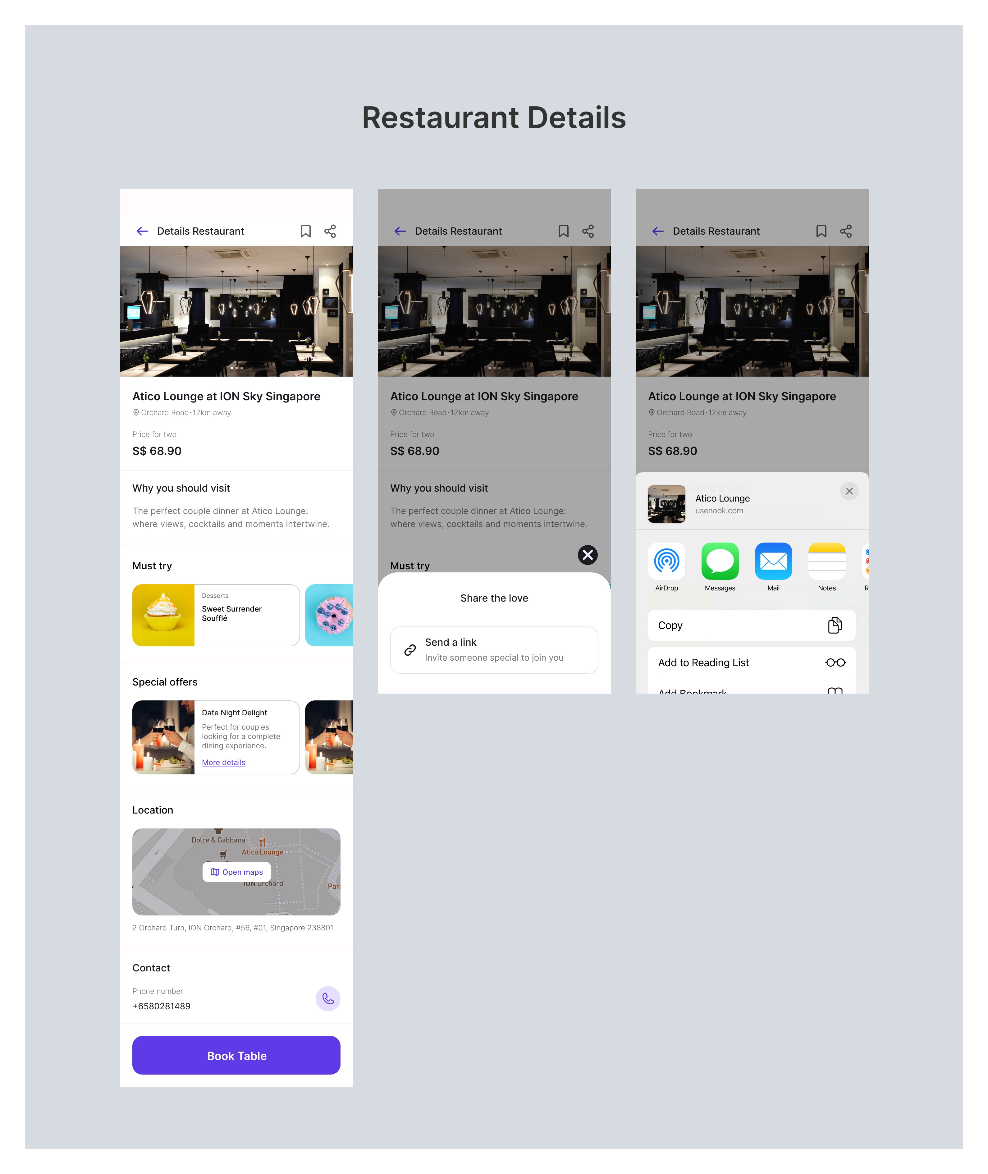
Restaurant Details
Now, in the high-fidelity design, the Restaurant Details Page unfolds with finesse. The wireframe comes to life, showcasing the restaurant's name, location, and distance with captivating visuals and refined typography. Each section — Why You Should Visit, Must Try, and Special Offers — is adorned with rich imagery, offering a sensory feast for the audience.
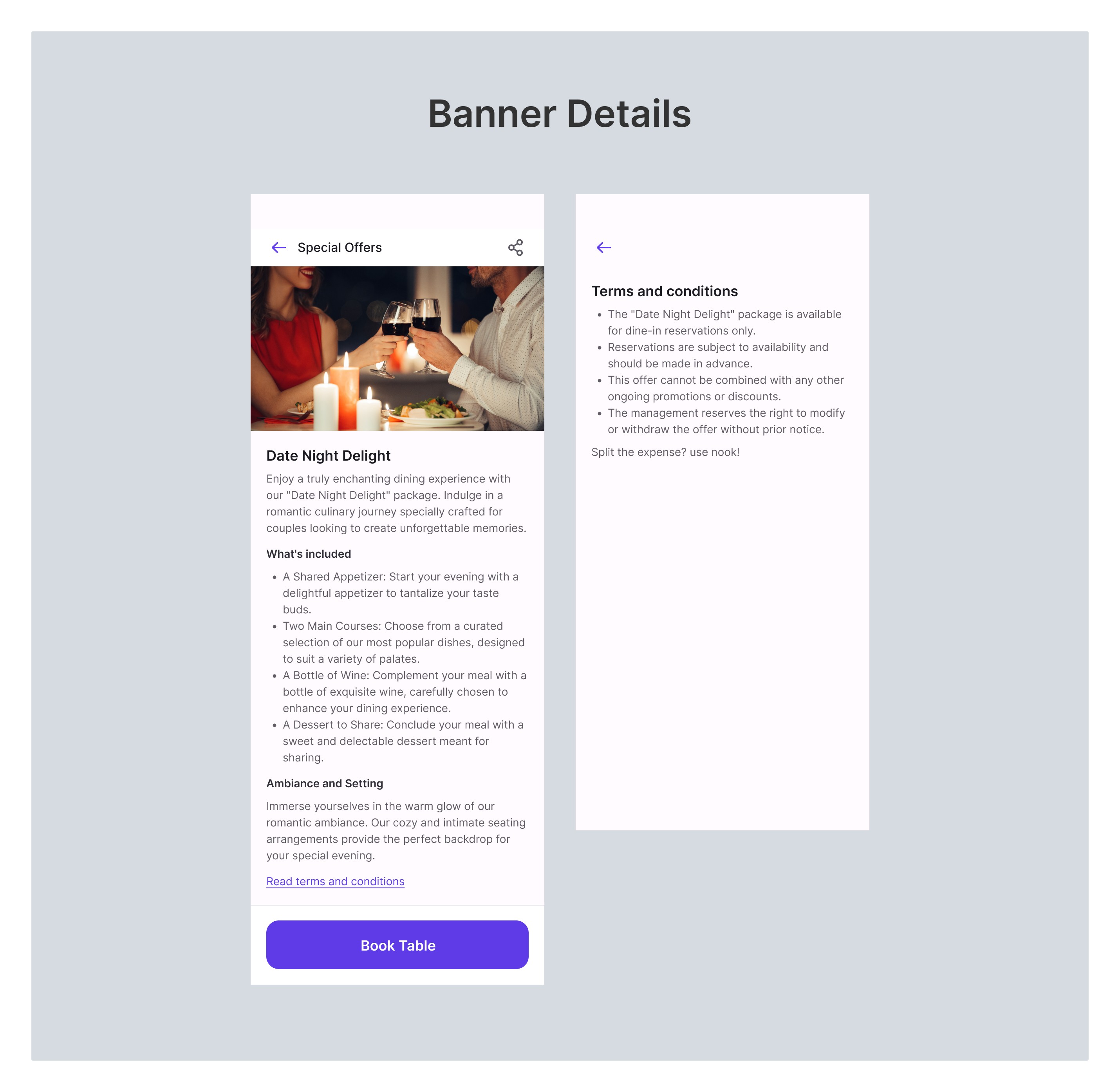
Banner Details
The high-fidelity design elevates this experience. Promotion banners burst forth with vibrant colors, high-resolution images, and compelling typography. The CTA button becomes an inviting portal, encouraging users to step into a world of culinary delights.
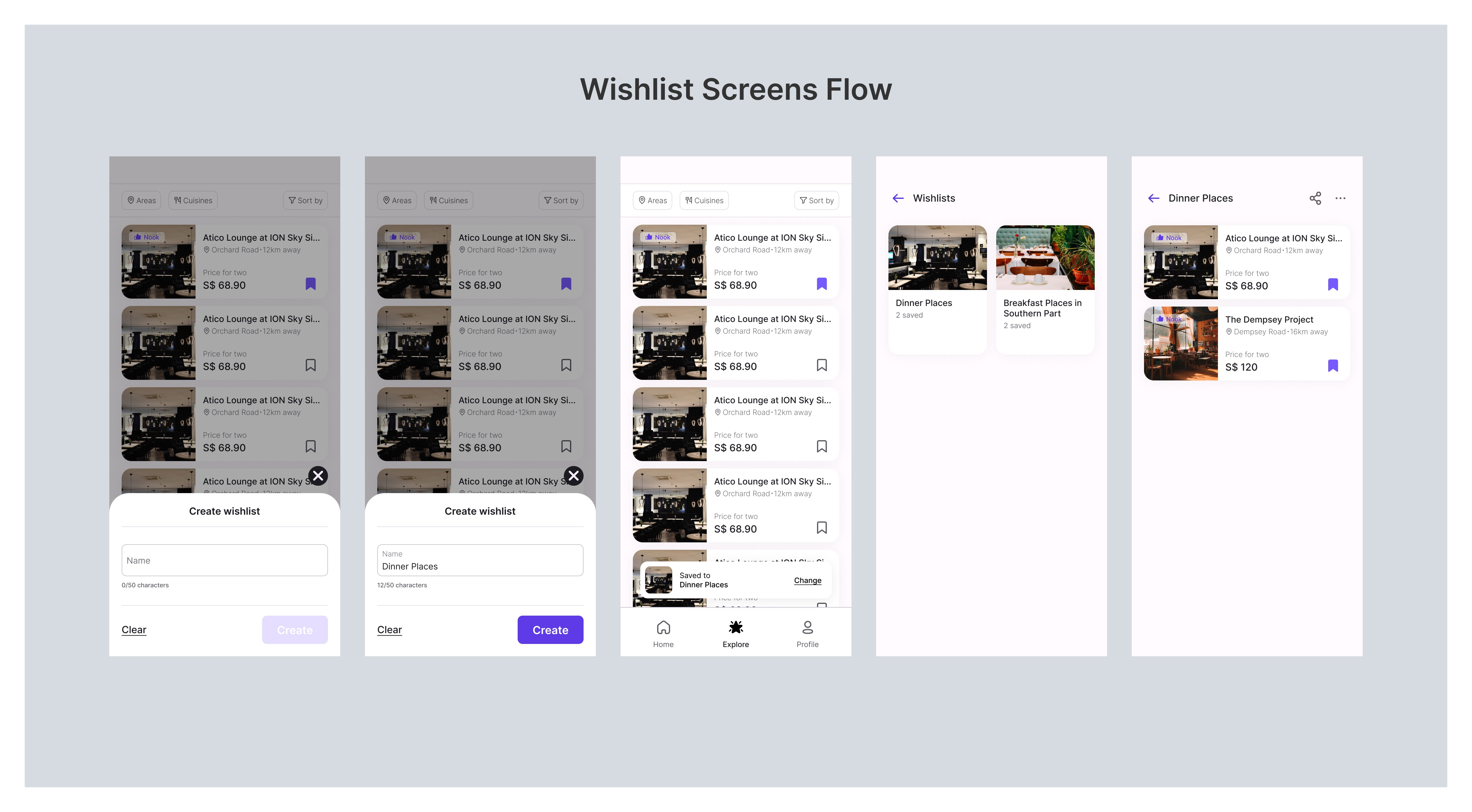
Wishlist Screens Flow
Jumping straight into high-fidelity design, the Wishlist Screens flow transforms the act of wishlisting into an intuitive and visually captivating experience. Users can effortlessly add and organize their favorite restaurants, ensuring a delightful journey within the Nook app.
Usability Testing
Objective
The primary goal of user testing for the Nook Explore feature is to evaluate the usability, accessibility, and overall user experience. The testing aims to identify any potential issues, gather user feedback, and validate the effectiveness of the design solutions.
Participants
Participants were Nook users for user testing, including:
Singaporeans and Expatriates
Participants from the age range of 18 to 60
Individual, Dating Couple, Married Couple
Test Scenarios
Exploration Scenario
• Instruct users to explore the Explore feature, discover restaurants, and interact with the filtering options.
• Observe how easily users navigate through different sections.
Reservation Scenario
• Ask users to attempt to reserve a table at a restaurant.
• Evaluate the seamless integration and user flow.
Wishlist Scenario
• Instruct users to add a restaurant to their wishlist and share it with their partner.
• Assess the ease of wishlist creation and sharing functionality.
Banner Interaction Scenario
• Have users interact with promotion banners, click on them, and explore the associated details.
• Evaluate the effectiveness of the promotional content.
Details Page Scenario
• Ask users to explore the details page of a restaurant.
• Assess the clarity and engagement of the details presented.
Testing Method
For testing method, I opted for Moderated Remote Testing using Google Meet. This allowed me to interact directly with diverse participants. The setup involved scheduling sessions, introducing the purpose, and obtaining consent.
Guiding participants through the Nook Explore prototype, I observed their interactions, asked probing questions, and took detailed notes on their experiences. The use of Google Meet facilitated real-time communication and valuable feedback.
Post-sessions, participants were given the opportunity to provide additional insights through follow-up surveys. This approach enabled an efficient and insightful testing process, laying the groundwork for iterative improvements based on user feedback.
Analysis and Iteration
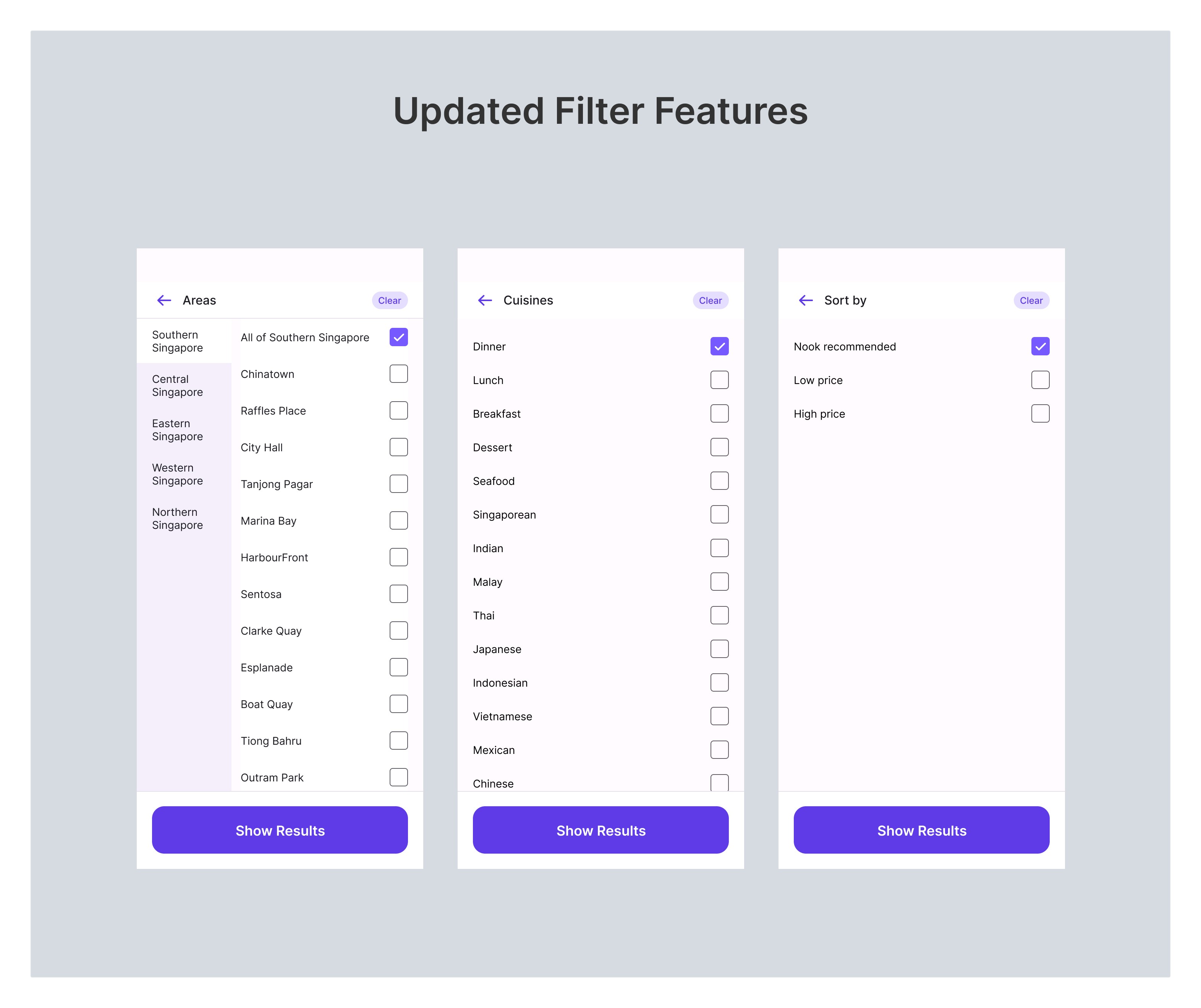
In the analysis phase, user feedback brought valuable insights, particularly regarding the Areas filter. Users expressed a preference for specificity in selecting areas, such as Marina Bay or Sentosa in southern Singapore.
Recognizing the importance of this, I aligned the layout of the Cuisines and Sort By filters with the Areas filter to maintain a consistent user experience. This ensures that the exploration process remains intuitive and user-friendly, addressing the specific preferences users expressed for different regions within Singapore.
This iterative approach aims to enhance the overall usability and responsiveness of the Nook Explore feature based on user input.
Here are the implementation screen pages.
Final Solution
Explore within the Nook app now provides couples with a delightful and efficient way to discover, plan, and reserve tables at restaurants in Singapore, enhancing their overall banking and lifestyle experience.
Conclusion
The Nook Explore feature successfully integrates finance and dining, providing a holistic experience for couples. The seamless navigation, engaging visuals, and user-friendly details page contribute to making Nook a versatile platform for couples to manage their finances and create memorable dining experiences together.
Business Impact
Directly attributing to the success, the Nook Explore feature propels business growth, contributing to a significant [confidential data] increase in revenue. This section underscores the pivotal role of the Explore feature in driving financial success for Nook.
